I’ve never heard of anyone actually using a nail gun to keep an image from jiggling around within their Word document. Doing so, however, wouldn’t surprise me.
From Monday’s blog post, I described how to put the two most common types of graphics into a document: pictures and line art, which Word calls Shapes. The graphics become part of the text, which often isn’t what you want. Time to free things up.
Non-Obvious Operation: Freeing an Image
It helps to think of your Word document as having several layers. On the basic level there is the page and the document’s text:
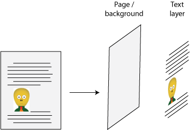
Fig 3. Text, Images, and the Page.
The page is paper, or wherever the document ends up. It’s a background. the text layer floats over the page layer. In Fig. 3 (above) you see the image is sitting on the text layer, which is how Word treats images when you first shove them into a document.
You can free an image by placing it in front of or behind the text layer, or allowing text to flow around the image. The key is to use the Format tab that appears on the Ribbon when you click an image in your text.
The two items in the Format tab that control text around an image are Position and Text Wrapping. They’re both very similar and confusing.
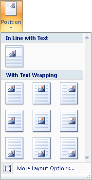
Fig 4. Position button options.
The Position button menu provides for basic text wrapping, as shown in Fig. 4. The standard option is In Line with Text, which is what you don’t want. By choosing an option from the menu, you place the image in a specific location on the page. Text wraps around the image, and the image won’t change position as you edit your text.
The Text Wrapping button menu is more flexible. It contains text wrapping options plus commands to move object behind and in front of the text.
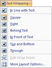
Fig 5. Options for text wrapping and layering.
When an image is behind the text, the text appears to be written over the image. This option can be used to place a graphic on the page like a watermark or for text decorations.
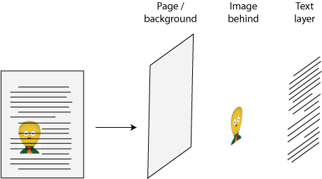
Fig 6. An image behind text.
When text is behind an image (Fig. 7), the image obscures the text, like a stamp or sticky note pasted over the text. The text is still there, but it flows beneath the image.
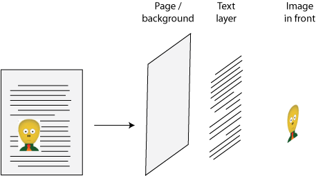
Fig 7. An image in front of the text.
Moving an image in front of or behind your text removes all text wrapping. So when you choose another option from either the Position or Text Wrapping menu, the image is thrust back into the text layer.
Unlike the commands in the Position button, the Text Wrapping commands keep the text and image together. My favorite options are Square and Top and Bottom (refer to Fig. 5, which has wee li’l previews).
You can also use the Edit Wrap Points to make weird shapes around your text, though (again) that’s more of the realm of a DTP program than a word processor.
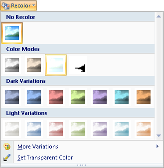
Fig 8. The Washout item for images behind (or in front) of your text.
By the way, if you do put the image in front of or behind text, then you should consider changing the image’s intensity: Click to select the image, then choose a high value from the Brightness menu. Or you can choose the Washout item from the Recolor menu (Fig. 8). That helps make your text more visible.
Next blog post: Messin’ with the image.


I really think that MS should offer a LaTeX interpreter and document editor. It might even be a part of the Office suite. Sure, mainly academics use LaTeX (though I have heard of some publishers using it because it allows for easy typesetting according to their printing process) and the market demand just isn’t there. But I can still dream of it – it will make life so much easier if I can import a word document into TeX and vice-versa.
Comment by sriksrid — June 2, 2010 @ 1:10 am
It would be nice if there were at least a modicum of consistency, specifically between releases of Word. Had Microsoft modeled what they do on something like LaTeX or TeX, it would have been a start.
I remember using TeX years ago and it was fascinating. I had only a text-based Unix terminal, but it was still amazing to watch all those codes turn into something really pretty when printed.
Comment by admin — June 2, 2010 @ 4:23 am
Is that a picture of a Wambooli in the example pictures?
Comment by linuxlove — June 2, 2010 @ 5:54 am
That’s a Mulvanian. They are space aliens I created in college. I even did an animated film of them (long gone). There was a book I wrote where the Mulvanians appeared in the illustrations, but I forget which book it was. If I remember, I’ll dig them up and post them on the blog sometime.
Comment by admin — June 2, 2010 @ 7:57 am
In my opinion, Microsoft could do a lot better in incorporating features like image formatting. The system they use doesn’t feel second nature, like every software feature should. I’m going to say this right now, if a company like Adobe made a word processor, it would completely dominate the industry, and it would be a lot more user friendly and easier to use.
Comment by gamerguy473 — June 2, 2010 @ 9:06 am
Whoopsie doodle, should have researched my last comment first:
Adobe has an online word processor called BuzzWord. I’m trying it now and I’m kinda impressed.
Comment by gamerguy473 — June 2, 2010 @ 9:12 am
You nailed it, Gamerguy. Microsoft doesn’t design things that seem second nature. Ever. It’s that second nature thing that makes me a big fan of the Android OS over the iPhone.
Comment by admin — June 2, 2010 @ 10:27 am