
It’s not hidden, yet you may have never used the feature. I’m talking about the Text Effects and Typography command in Word. It can really do some crazy things to your document’s text.
The Text Effects button lurks on the Home tab in the Fonts group, shown in Figure 1. You can use that menu to pluck out a text style. When text is selected in the document, you can preview the style live. Try not to barf.
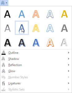
Figure 1. The Text Effects button in the Font group.
For more specific controls, you can summon the Format Text Effects dialog box:
- Click the dialog box launcher found in the lower right corner of the Font group on the Home tab.
- In the Font dialog box, click the Text Effects button.
- In the Format Text Effects dialog box, click the Extended Effects button.
- Use the options to control how the effects are applied to your text.
- Click the OK button to apply the affect; close the Fonts dialog box as well.
Figure 2 shows the Text Effects dialog box with the Extended Effects button’s categories shown. (That button is the one on the right.) The dialog box allows you to customize the text effects to a greater degree than you can by just plucking a preset effect from the Text Effects button.
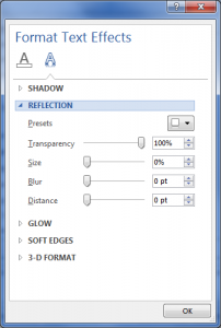
Figure 2. Customize text effects by using the Format Text Effects dialog box.
You can play and have fun with text effects all you like. The problem is that they don’t really add anything to your document’s text. They can, however, be used effectively for headings, decorations, or fancy titles. That’s the best way to put them to use.
Graphic designers will tell you that the goal is to communicate with your reader. The key to making that happen is to create readable text. Typography has evolved over the past hundred years to where various typefaces have been optimized to make reading easier.
For example, the human eye prefers reading text with a serif font — letters that have little points on their ends. The eye enjoys reading that typeface more than a sans serif font, which is better suited for document titles and headings.
Yet the more junk you add to the text, the more it stops the reading flow. For example, bold or italics text slows down the eye. That’s great for adding emphasis, which is the point of bold and italics. But you don’t want to arrest all reading speed by junking up the text with a mishmash of fonts, sizes, styles and effects. That would render the document less readable.
So while the text effects can be fun and entertaining, save them for titles, headings, or decorations. Please O please, don’t festoon information you want someone to read with obnoxious text. Your readers will thank you.