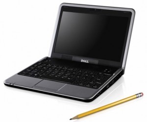
Maybe it’s just me, but I see way too many pencils used with computers and high technology. No, not real pencils, but pencils in advertising, logos, and icons. It has me puzzled.
A pencil is probably the least high tech thing ever invented. Essentially it’s a wooden wrapper around some type of substance used to put marks on things. Originally the substance was lead, but then it became graphite. The concept is as old as cave painting.
Somewhere along the line, an eraser was added to the basic pencil. (The rest of the English-speaking world calls it a rubber.) It was a move of sheer genius, the first hardware Undo command.
Pencils are still used in our culture, though outside of the artistic world, it’s rare to see a pencil these days. That is, unless you go full high tech, in which case the pencil makes some bizarre statement. Consider this advertisement:

Who the hell needs a pencil with a laptop? Apparently the genius who created the image (not cheap) feels that buying a laptop (not cheap) will be encouraged by the reader (not cheap) identifying himself with someone who uses a pencil (cheap) and a computer (not cheap) at the same time.
(Okay, maybe the pencil is there to show the relative size of the laptop? But then again, a coffee mug would work equally as well.)
The pencil is obviously some sort of icon. In fact, pencils often find themselves used in computer icons more than any other office implement. Ever see something like this:
![]()
Originally that icon was used for word processing, but just about any program that involves creation — including programming tools — often employ the iconic pencil.
The pencil is a silly piece of wood. Yet for some reason, its appearance in the high tech world is ubiquitous. A stapler or paper clip is more indicative of the office environment. And a coffee mug would be a better size comparison.
Of course, the pencil isn’t alone. What about the folded newspaper next to a laptop? What’s with that? Who reads a newspaper when you have a computer? And don’t forget the eyeglasses (reading glasses?) on top the newspaper. Low-tech at its best.
Yeah, well, I do confess to reading the newspaper in front of my computer. But I definitely don’t have a pencil next to any laptop — or desktop, for that matter.


Nice observation… What is more, the picture above doesn’t even have scratch paper in it (I do a lot of scratch work while using my computer, though I use a pen – maybe there are just too many kinds of pens to be able to settle on a perfect pen as a logo?)
Which got me thinking – all Windows applications still show a floppy to save data – how many more years will that carry on? At least every child uses a pencil in the beginning – but a generation of computer users would soon never have used a floppy disk. Will that icon be replaced?
Comment by sriksrid — September 12, 2008 @ 4:14 pm
Excellent observations, sriksrid!
The only pens I remember seeing in computer ads were fountain pens — yet another degree of silliness.
I wrote about that floppy disk icon for “Save” a long time ago. Considering that most teenagers using computers today have probably never seen a floppy disk, it’s a bad symbol. Macintosh-native programs, curiously, don’t have a Save button on the toolbar. Microsoft Office applications for the Mac (which I don’t consider to be Mac-native) use the floppy disk icon for Save.
The whole toolbar paradigm needs to be reviewed. Microsoft (typically) goes overboard with icons and toolbars, the Ribbon being the most current offense. I think users can be trained to understand and recall basic keyboard shortcuts, which negates the need for an overload of toolbar buttons.
Comment by admin — September 12, 2008 @ 4:27 pm
I think the reason for the pencil in the icon (I think for Kate or Kedit, am I correct?) is to illustrate the point simply, like a road sign. But how does it illustrate the point when it’s so ambiguous? From the icon, it could mean it helps you develop templates for a Gutenberg-style printing press.
A lot of them have, actually, but it’s still a bad symbol.
Exactly: and that’s just how I like it. Let’s take Pages as an example: the buttons for adjusting the view, turning on change tracking, bringing up the Inspector, etc, live in the toolbar. The ‘file’ operations live exactly where you’d expect them to be: under the file menu. No space is wasted on the toolbar, and, indeed, it’s more difficult to overzealously add buttons. You’re actually required to write NSToolbar routines to stick them on, so no over-zealous dragging and dropping onto the toolbar Visual Studio 2008-stylee, thank you very much.
Comment by Jonathan Rothwell — September 14, 2008 @ 4:28 pm