
The Google Play Store has come a long way from the old Android Market. The modern version of the Android app store — Oops! I can’t call it that. Thanks, Apple! &mdash has lots of good features and provides excellent information for everything it offers. The key is understanding how that stuff is presented.
First, a look back in time to the old Android Market.
Figure 1 illustrates the app description screen from the Android 2.2 version of the Market app. A similar screen can still be found by looking up app details in the Settings app, but back in 2010 or so, what you see in Figure 1 was what you saw when you wanted “more information” for an app offered in the Android Market.
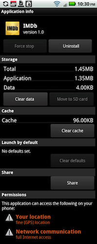
Figure 1. The description screen for the IMDb app back in 2010.
Contrast Figure 1 with Figure 2, which is shows how the current version of the Play Store lists an app’s description. Yes, it’s far more friendly.
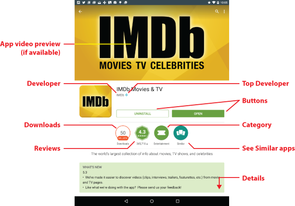
Figure 2. The 2015 version of the IMDb app’s description screen.
Quite a few apps feature a video preview, although IMDb in Figure 2 does not. Other detailed information is found by swiping the screen, but the top portion is the most important. That’s where most of the info is crammed.
The app is named, the developer is named, and if the developer is one of the top Android developers, their name is followed by that blue-square/flower icon.
The Uninstall and Open buttons change depending on when and whether you’ve installed the app. If you don’t have the app, you see the Install or price button. If you’ve just purchased an app — and you’re very quick — you see the Refund button.
Below the buttons you find several medallions (my term) that offer more information about the App. These include the number of times the app has been downloaded, ratings and comments from other users, the app’s category, and a button you can tap to view similar apps. If your Google friends have plussed an app, then a medallion appears with their charming image inside.
More details are obtained by viewing the rest of the screen, which can get quite tall. Unlike the earlier Android Market description screen (Figure 1), the new Play Store wants to cough up as much information about the app as possible. Key items I look for are the total number of downloads as well as average rating and comments from other users.
While all this data is valuable, it does tend to junk up the screen. A new addition, which is planned but I’ve not yet seen, is a rating system for the app’s age-appropriateness similar to the ESRB system for rating video games. Still, all that info is helpful and good to know, even if it can be overwhelming.